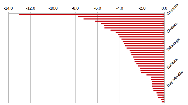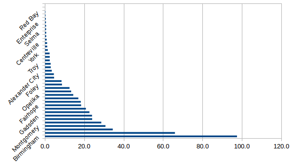
The graphs and interactive tables on this page show the Primary Care Service Areas (PCSAs) that need additional Primary Care Physicians (PCPs) and those that have a surplus. The tables are sorted to match the graphs: from least need to greatest need and form least surplus to greatest surplus. However, you can re-sort the tables by clicking on any of the columns, and you can filter by entering text in the search bar. The footer gives summary information for the combined PCSAs.
The supply-demand method computes PCP FTE need in a PCSA by dividing the total PCP time required by the population (based on average visits per year and time per visit for various age groups) by the time available for a PCP (based on average work time with patients). The fields in the tables are PCSA name, an indicator variable for urban (1) or rural (0), the population of the PCSA, the PCP FTEs in the PCSA, and either the deficiency or surplus of PCP FTE.
| PCSA | Urban/Rural | Population | PCP FTEs | FTE Deficiency |
|---|---|---|---|---|
| 40 | 35 Rural | 1,398,218.9 | 351.15 | −126.3 |

| PCSA | Urban/Rural | Population | PCP FTEs | FTE Surplus |
|---|---|---|---|---|
| 27 | 13 Rural | 3,436,760.4 | 1661.1 | 493.21 |
